Friday, 17 October 2008

Textual Analysis of 3 Magazines


Q Magazine
This magazine is a very conventional magazine. It has a main masthead in the top left corner of the page complete with a strapline. the picture is centered in the middle of the page with the main title across the page which is the bands name which makes it more recognisable to the auidence therefore grabbing the reader's attention. there is numberous plugs across the page further grabbing the reader's attention and letting the audience know what else is in the magazine. The barcode is undernieth the masthead with the date, issue and price. Despite the band being slightly over the masthead, the magazine is still recognisable to the auidence so the publishers/editors arn't afraid to do so like this. The auidence for Q is an older aged auidence ranging from 20-50+ as this magazine covers alot of the older bands such as metallica. Also the language used is a more mature formal editing.


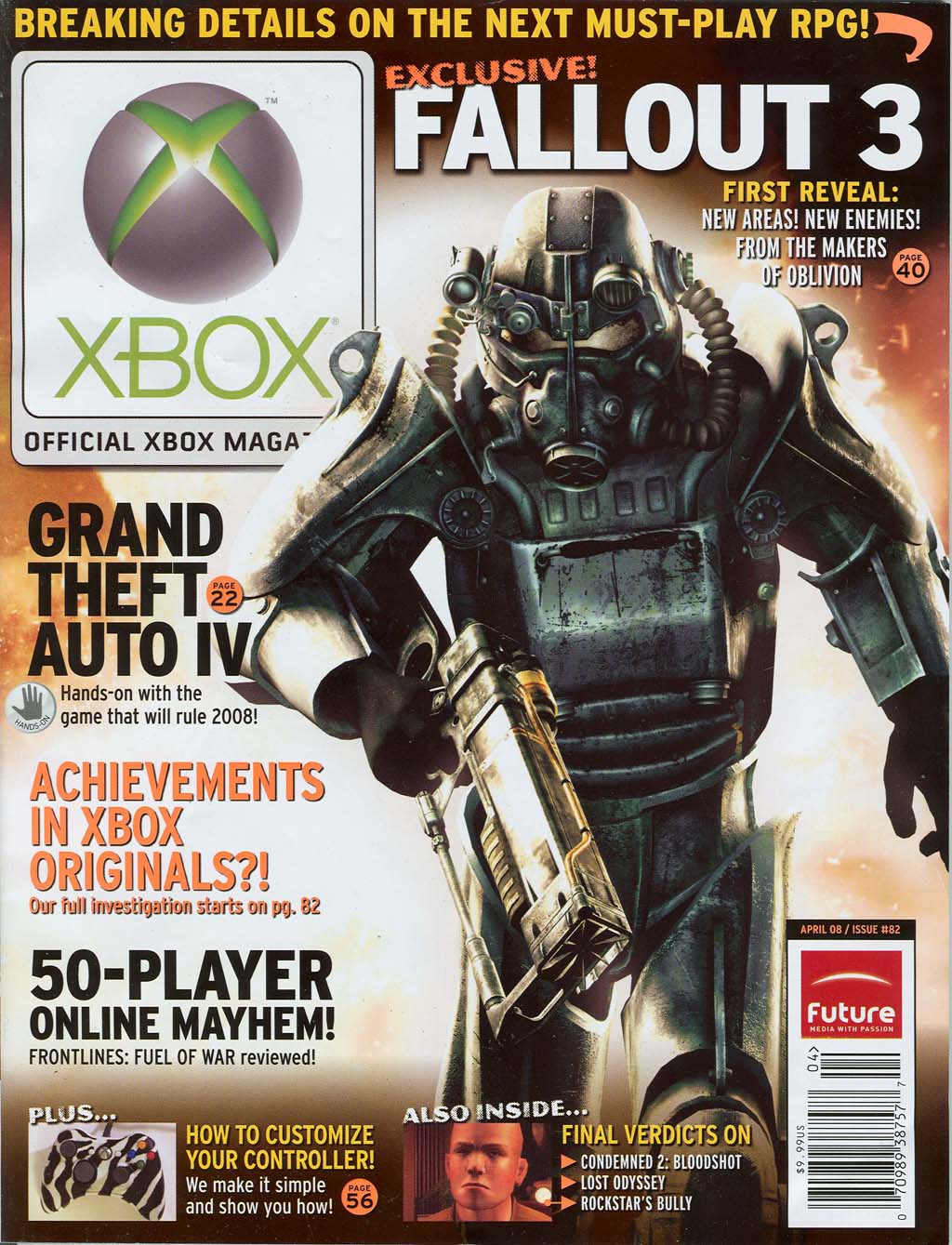
Official Xbox magazine
This magazine like Q, is a very conventional magazine with the masthead in the top left corner of the page complete with strapline. the picture is slightly right alligned leaving enough room down the lefthand side of the page for plugs. The main plug which goes with the picture is in the top right hand corner of the page so its not to cover over the picture or any of the plugs. The plugs are their to grab the reader's attentions and to inform them as to what is in the magazine. the barcode, unlike Q is in the bottom right hand side of the page with the publisher logo, date price and issue. The auidence is alot younger then Q and is around 13-20 year olds or anyone who enjoys gaming and software. There is also pictures included with the plugs to appeal more to the readers.


Heat magazine
This magazine like the others, Q and Xbox, follows the main conventions of a magazine. the masthead is in the left hand corner of the page. The main picture goes across the middle of the page and is alligned to the right so the plug can go to the left of the main picture. There isn't many plugs on this magazine but there is still a few which will grab the reader's attention like used in the other two magazines. The plugs go along the bottom and along the top spaceing them out so the page doesn't look conjested and messy. The bar code is unconventionally higher up then we would expect to see it in either a corner or at the top.
Tuesday, 7 October 2008

Textual Analysis of "Secondary Teachers Magazine" Front Cover

The title on this magazine is large and noticeable, it is in bright colours to make it stand out and the first word 'Secondary' is more dominant than the second word 'Teachers'.

The main image of the cover is two ginger bread men on a baking tray, the decoration on the two gingerbread men are gender specific, the differences between them are very little. The only differences between them are to show gender are that the female has red cheeks, a bow, and a black wavy line to indicate a skirt, although these differences are small the audience immediately know that they are a boy and a girl.

At the bottom of the magazine there is the logo for the company that produces the magazine, a rainbow with 'department for' written in a navy blue and 'children, schools and families' written in a vibrant red, again this is against a white background. At the other side of the magazine opposite the logo there is the date that this particular issue was released, and the website to the magazine.

The idea behind the front cover is that the person presenting the baking tray with the gingerbread men on it has made two students/pupils that are well made. It could also connote how fun and interesting school and education can be

The main audience is teachers. Although it can be read by parents of students and even the students themselves.

Foundation Portfolio, Preliminary Task

For the preliminary task we was asked to make a college magazine. This would include the front cover and the contents page. We looked at how conventions and key media concepts applied to the task and explored each feature of the acronym LIIAR:
  • Language
  • Institution
  • Ideology
  • Audience
  • Representation

Language:

The language is the layout of the media. This is everything such as the font of the text, the text, the photograph, the process of the photograph ( black and white to colour), the masthead, the colour, the size of the text, colour of the text.

Institution:

The institution is us/Wyke college.

Ideology:

The ideology is the main message that I want my magazine to portrait. This is that Wyke College has high standards with high A-Level results year to year.

Audience:

  • Students at Wyke college aged 16-19
  • Staff at the college, teachers and other staff
  • Mainly from the Hull/East Yorkshire area
  • 64% females at the college, 36% males at the college,

Representation:

How we represent the college through:

  • Photographs, type of angles
  • The main story, sub-stories, how the story fits in with the photograph
  • How we promote the college through the photograph and stories